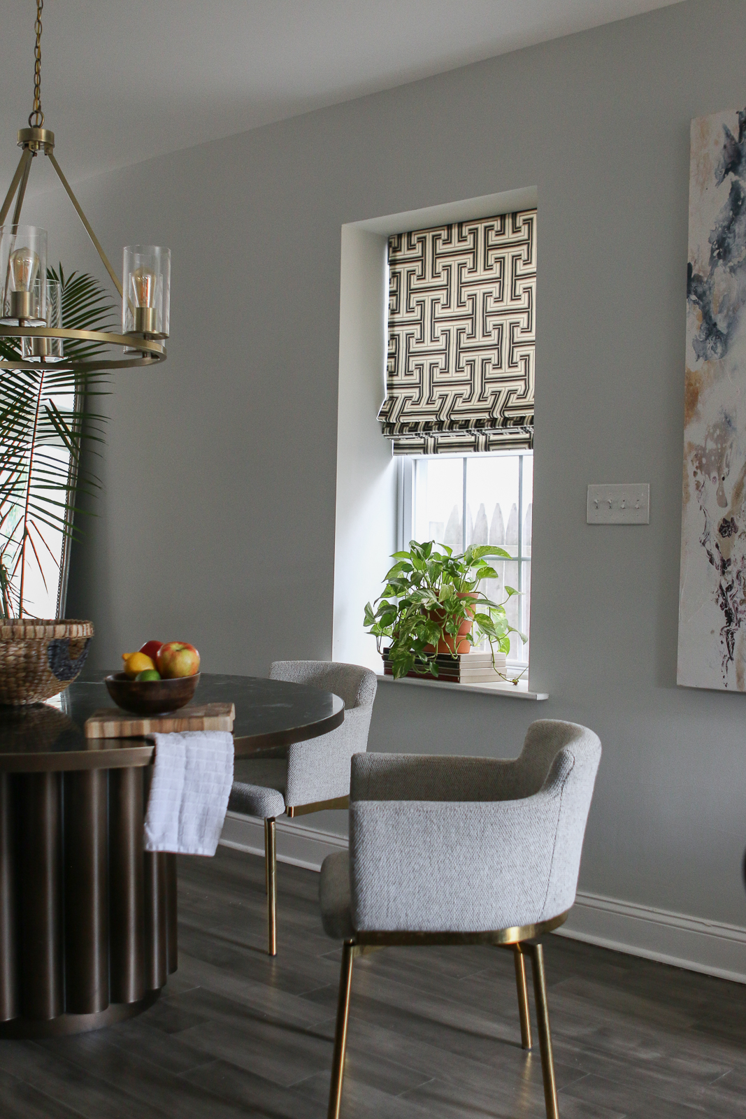
When we first moved into our home, we weren’t quite sure what to do with the windows. We went back and forth with so many different options. We knew that the windows in the dining room and kitchen couldn’t have drapes. It wouldn’t make sense in those spaces. But we also knew that we didn’t want to just throw up a basic blind. The other space we needed to handle was our bedroom. We did know that drapes were a must in that space. We’ve taken so much time to curate our home so we didn’t want to cut any corners with the windows. Design is such a passion of ours. We love creating spaces that fit our needs and transport us to a place of calm and serenity. Believe it or not, the proper window treatments can do that!
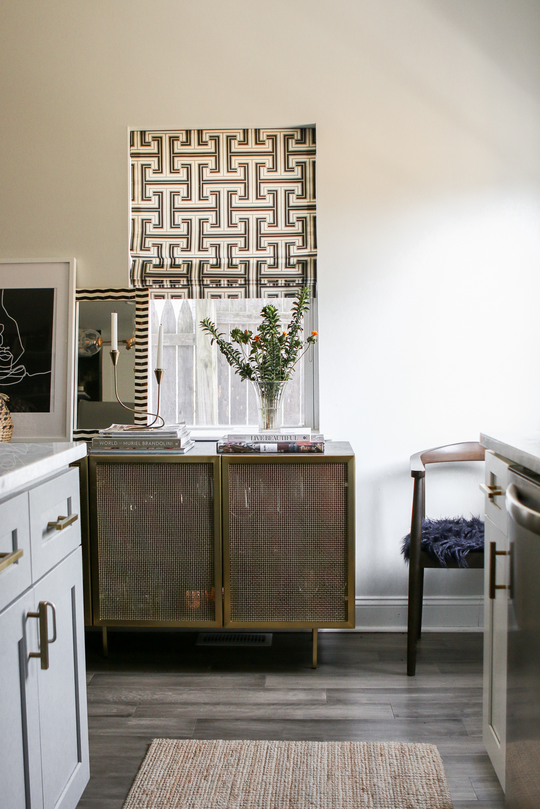
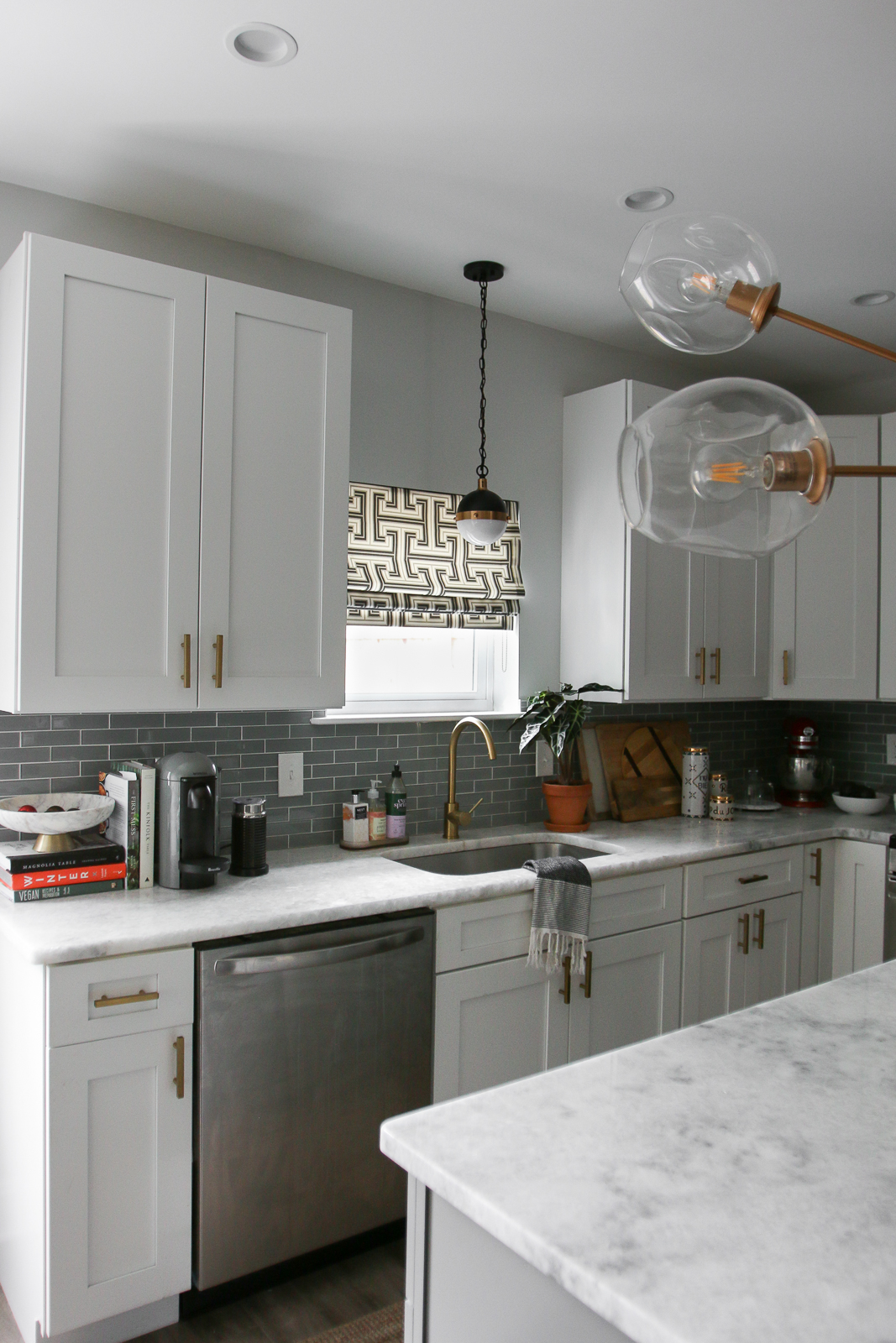
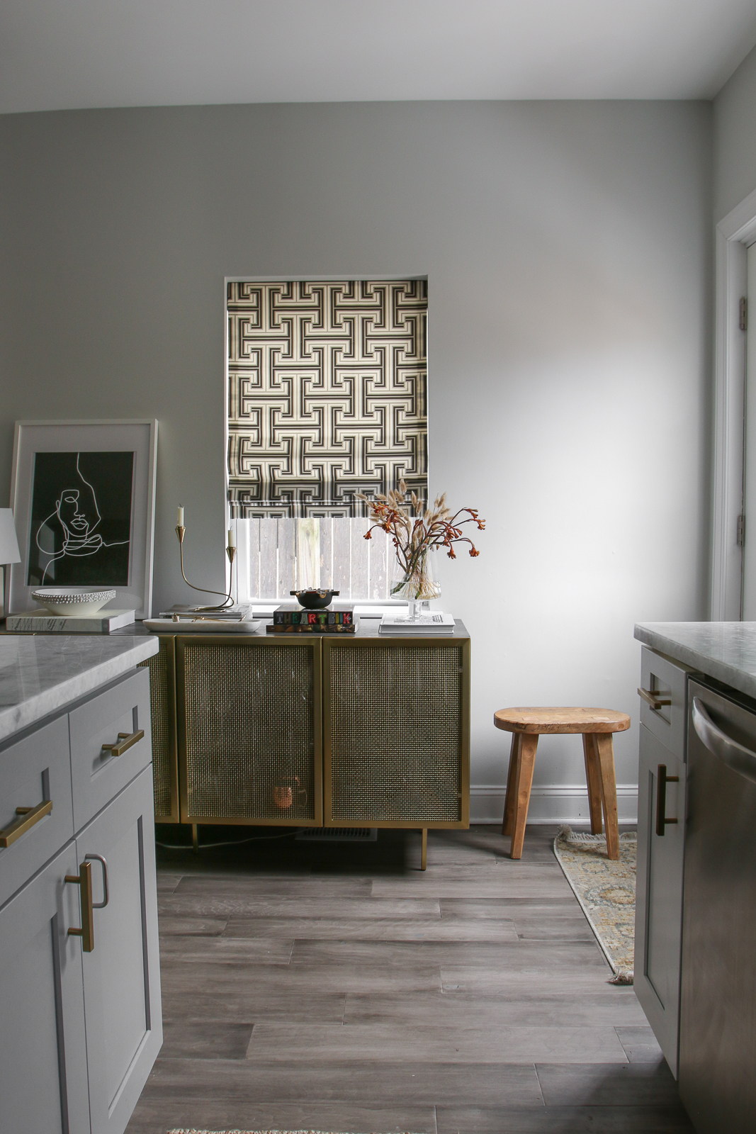
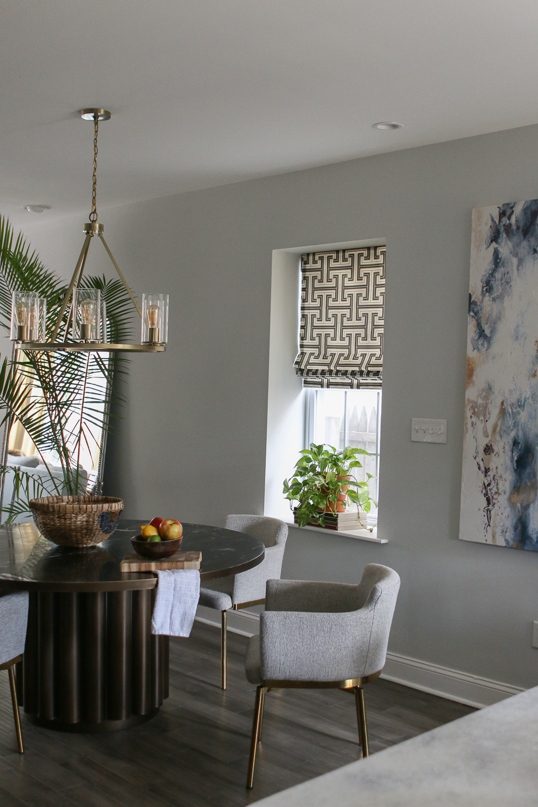
We were fortunate enough to partner with The Shade Store to create the windows of our dreams. Starting on the first floor, we decided Roman Shades were the best option. They are super sleek so they don’t take up too much space. We knew we didn’t want to choose a solid color. We needed something that made a statement and truly acted like art. That’s where Jonathan Adler comes in. You’ve heard us talk about our love for his designs for years. He released a collection with The Shade Store that was right up our alley. We decided on the Peking Greek Key design for the shades. The colors are exactly what we wanted and the design is truly art. No matter if they are all the way up or all the way down, the design looks great. We couldn’t be happier with the choice we made.
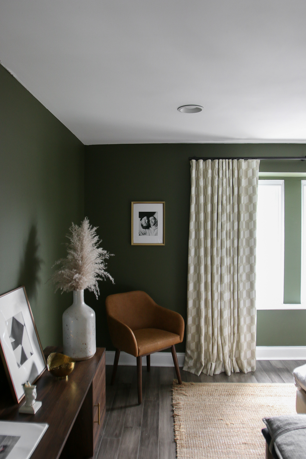
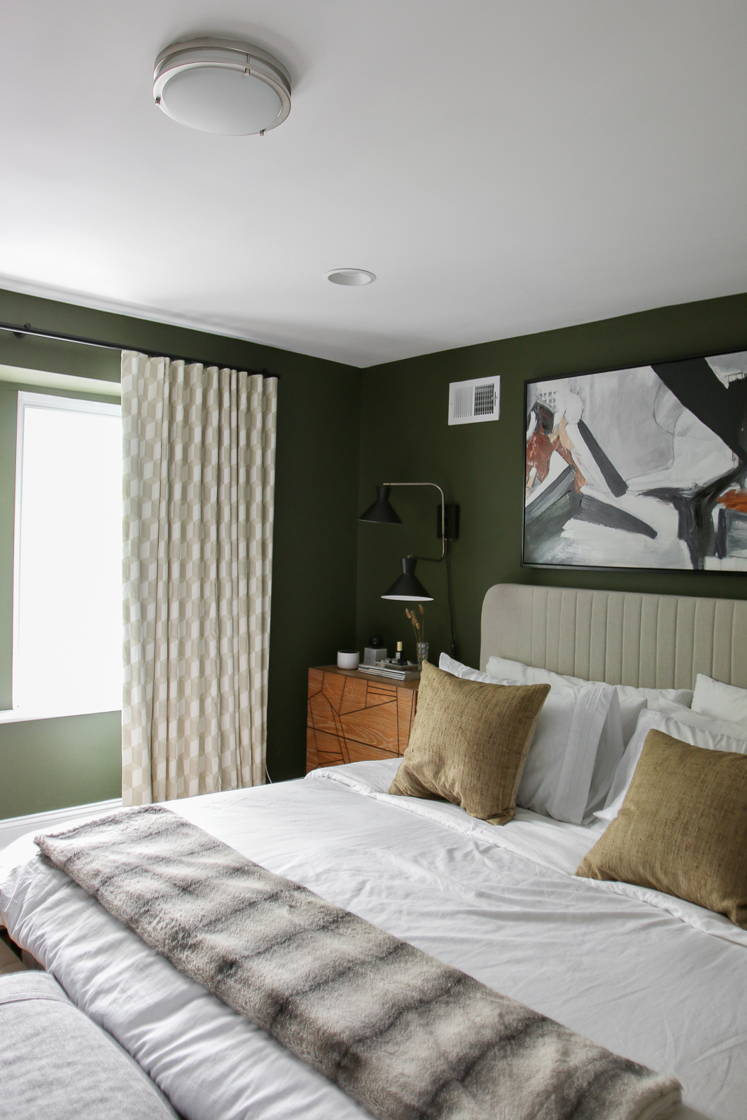
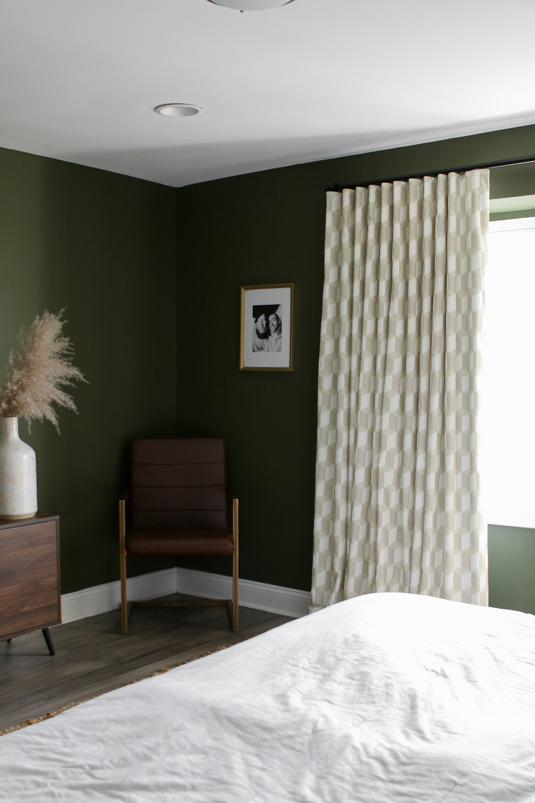
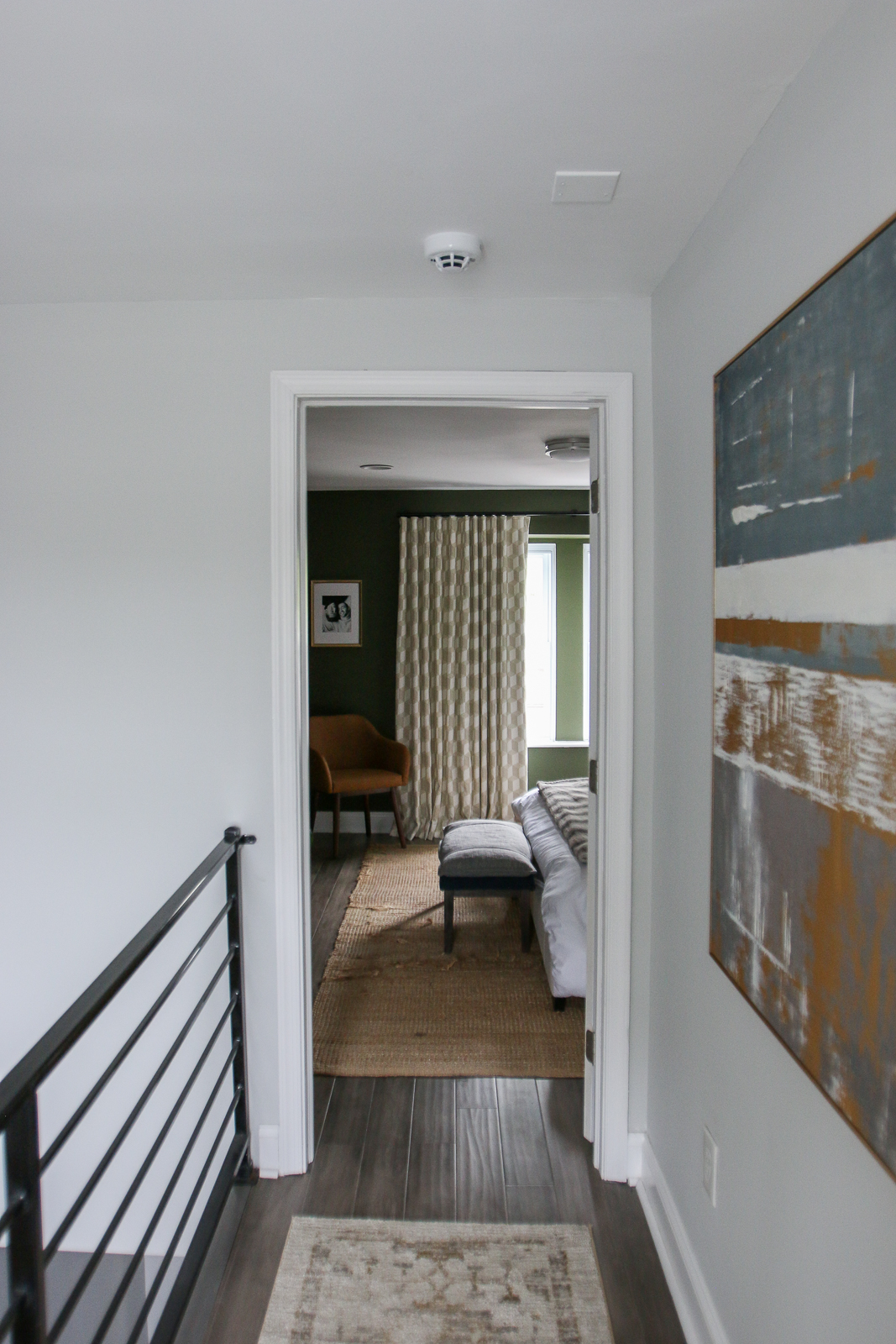
Now for the master bedroom, curtains were a must. We wanted to create a hotel-like environment. You know when you walk into a hotel and the curtains feel like they wrap you up — that’s what we wanted. But we also had to be mindful of the wall color. Since we have a deep green, wanted something light to balance out the space. After looking through the collection, we ended up falling in love with Versailles Cube in the color sandstone. For the hardware, we chose a black rod. The curtains were installed in a way that you can’t see the rod when they are shut — something we love! It feels super luxurious — like that hotel vibe we were going for. We are thrilled with how they look in the space. The design compliments the wall color so well.
So what do you think? Let us know in the comments below! Until next time…
