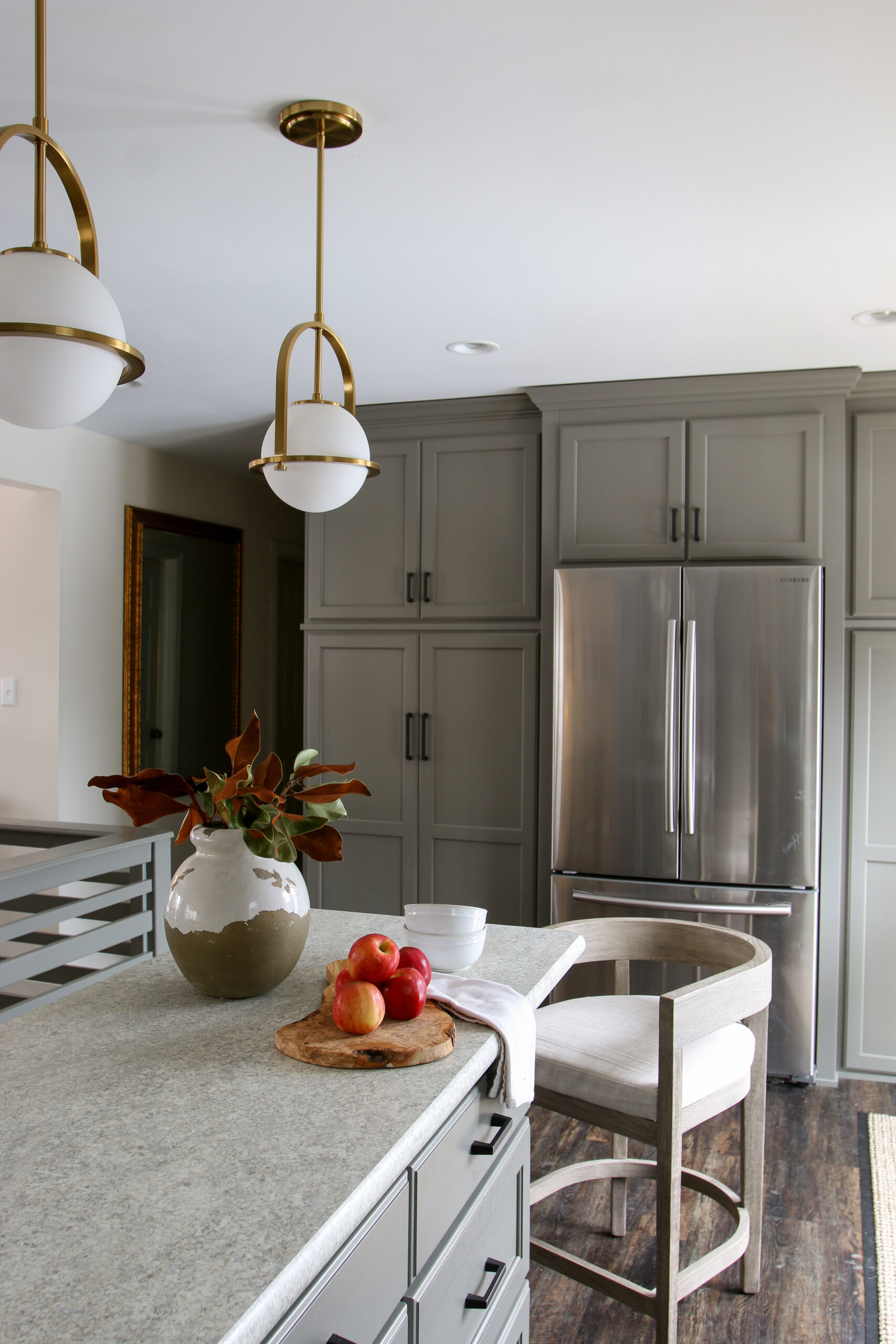
After years of dreaming of redoing their home, Alex’s parents recently redid their kitchen and main living area. This has been a huge transformation and we knew we had to share it with you! We posted a photo on Instagram but it deserves a full blog post. The home is a ranch-style with two bedrooms and one bathroom upstairs and a finished basement with two bedrooms, one bathroom, and another living room area. Overall, the home is very traditional but they injected some modern elements with the new kitchen.
The renovation focused on the kitchen, upstairs living room, and garage. To add more space, Alex’s parents turned the upstairs living room into a dining area, gutted the kitchen, and turned the garage into a great room. As we sit here writing this post, it looks so different. We’re currently sitting where a garage door used to be lol. For the kitchen, it was out with the old and in with the new. That meant everything had to go. Over the years, they had done some DIY projects to spruce up the kitchen but nothing major. For the renovation, they had custom cabinets built that added so much storage and function to the space. We are in love with the color choice for the cabinets. It’s a really interesting shade of green that packs a major statement. Matte black hardware pulls it all together.
The layout changed a bit too. The furthest wall became the new home for the fridge with floor to ceiling cabinets flanking both sides. By taking the cabinets to the ceiling, helps draw your eyes up and gives the illusion of a much larger space. They also installed new glass doors that lead to the backyard — allowing in a ton of natural light. You know how much we think about natural light in a home. One day we will have our hallway of windows!
We did help a bit with some of the design choices — are you really surprised?? Lol we always love sharing our thoughts. Alex’s mom really wanted open shelves so we suggested she add these gorgeous sconces above to create a statement. It helps draw your eyes up and creates a cozy ambiance. We also recommended the lights over the island. The brass complements the sconces incredibly well. Overall the kitchen is warm, inviting, and functional. What do you think?!
Now onto the dining area — previously a living room space. They added a new light, dining table, and credenza. The room is calm and inviting allowing in a ton of natural light with the large picture window. We’re very jealous of the light since we definitely do not have that much in our home. The space feels very open since there are no walls — everything flows from the kitchen to the dining area to the new great room. The wall between the main home and garage was taken down to create a large living space. In place of the garage door, three windows line the wall. Again, more natural light. The ceiling was opened up to create 14′ high ceilings. This instantly draws your eyes up and creates a visual experience. They still need to find a coffee table but that will come eventually. The rug in the living room was originally under the dining table but we switched it around while visiting. It fits the living room really well so they are going to find a new rug for the dining room. Oh and also new sofas. By spring it should all be finished but we wanted to give you a look now. We’d love to hear your thoughts!
The Kitchen.


The Dining Room.


The Living Room.


SHOP THIS POST


The textured picture above the dark gray cabinet in the living room is hung incorrectly. I would rotate it 90 degrees to the left or right — whichever looks better.
I’m curious about the staircase. Did it used to be walled off? My house has a similar layout.