Recently we felt a bit uninspired with our entryway console table. We’ve had the same setup with the same accent pieces for a while now and had been itching to switch it up! More times than not we like to go through our home and restyle certain areas using what we already have – keep us creatively inspired and bringing new life to our home. It’s such a fun way to reinvent the look and feel of a space. We don’t always stick to the same color story, accent pieces or choices of lighting. We like to fully revamp the console to spark a feeling within. About a week ago, we started getting bored with how it was looking so we decided to switch things up. This sparked an idea for a new post — one console, three ways. We took inspiration from all of the outfit posts circulating out there, ya know, the ones where you take one denim jacket and style it multiple ways.
Typically when we start coming up with a design for an entry console, we think it is important to incorporate three focal points that have become a staple for us. As always, this does not mean we always stick to or add these specific design elements to every console. What are these three focal points? We like to add a source of lighting, a touch of greenery to bring a bit of nature indoors, and some variation of stacked books. Incorporating these elements will definitely have your space feeling curated to your sense of style! So here it goes.
Modern and Vintage Collide
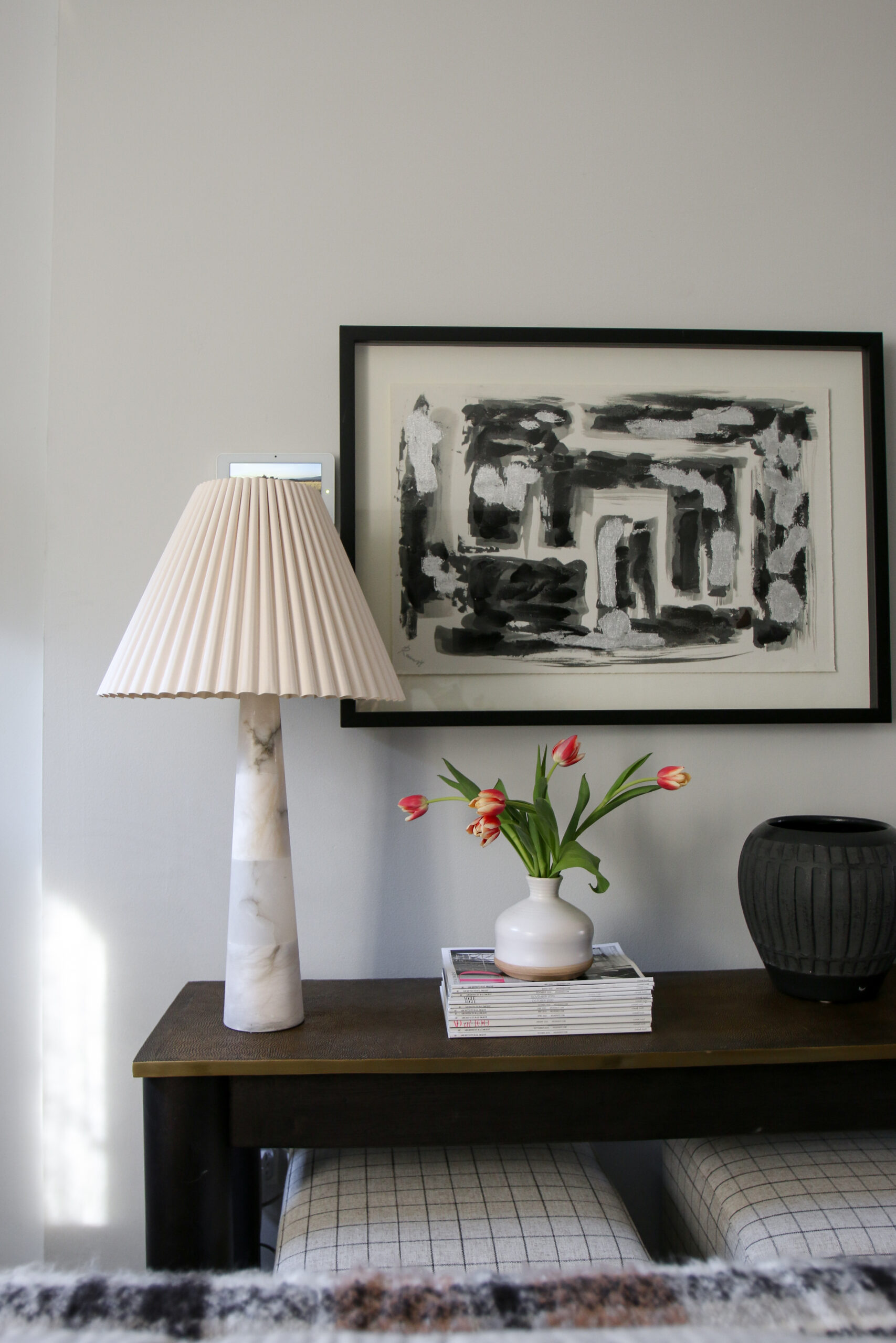
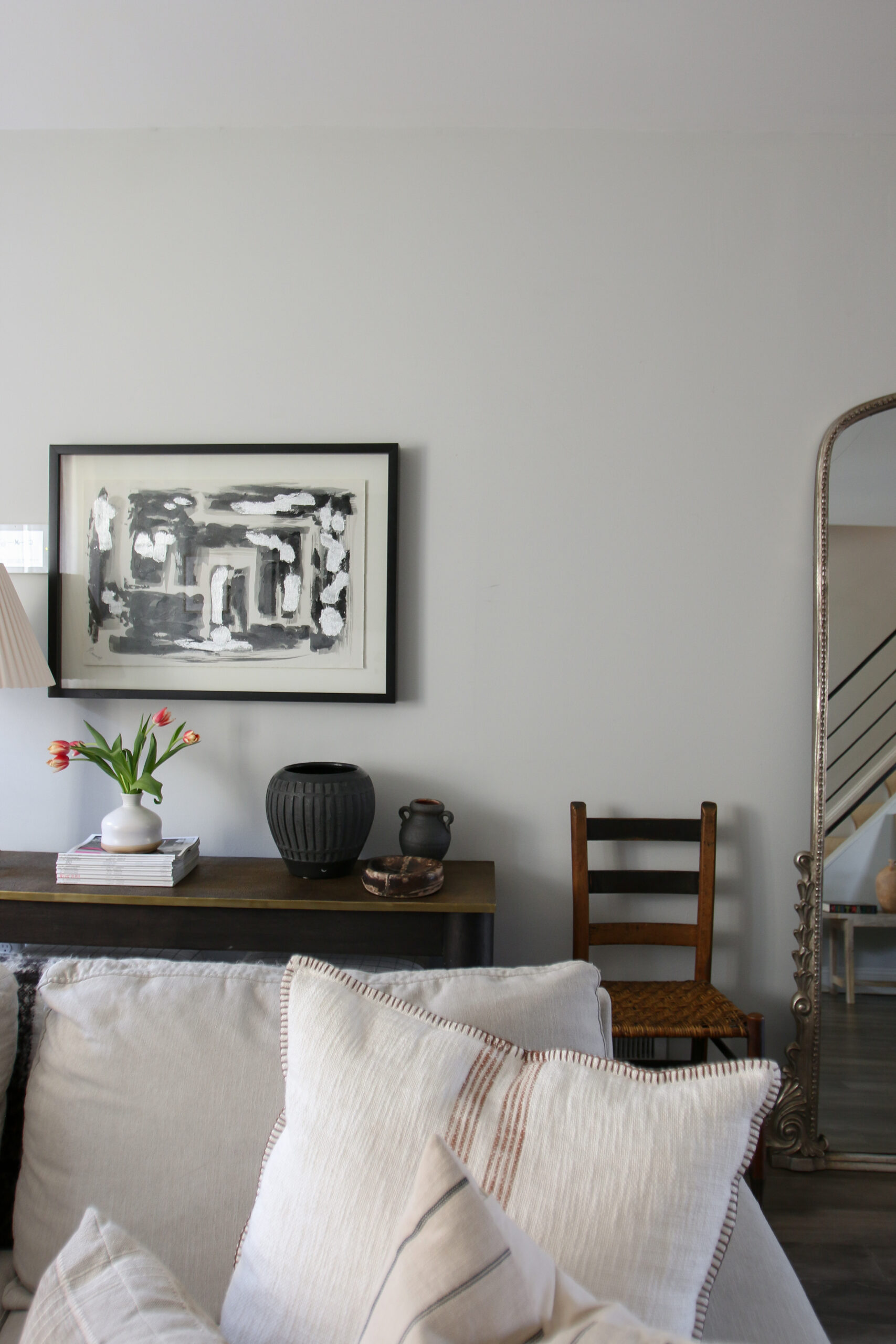
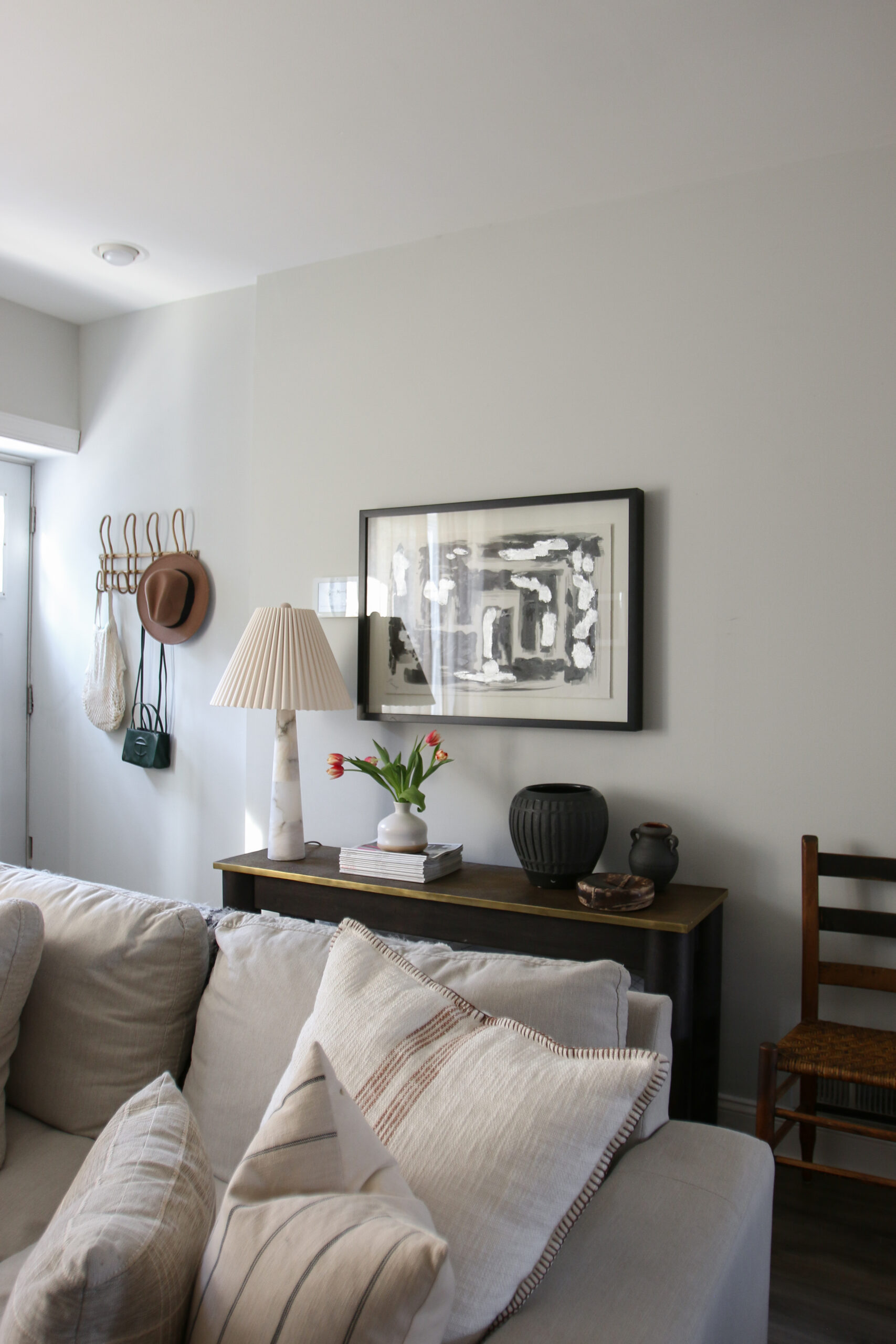
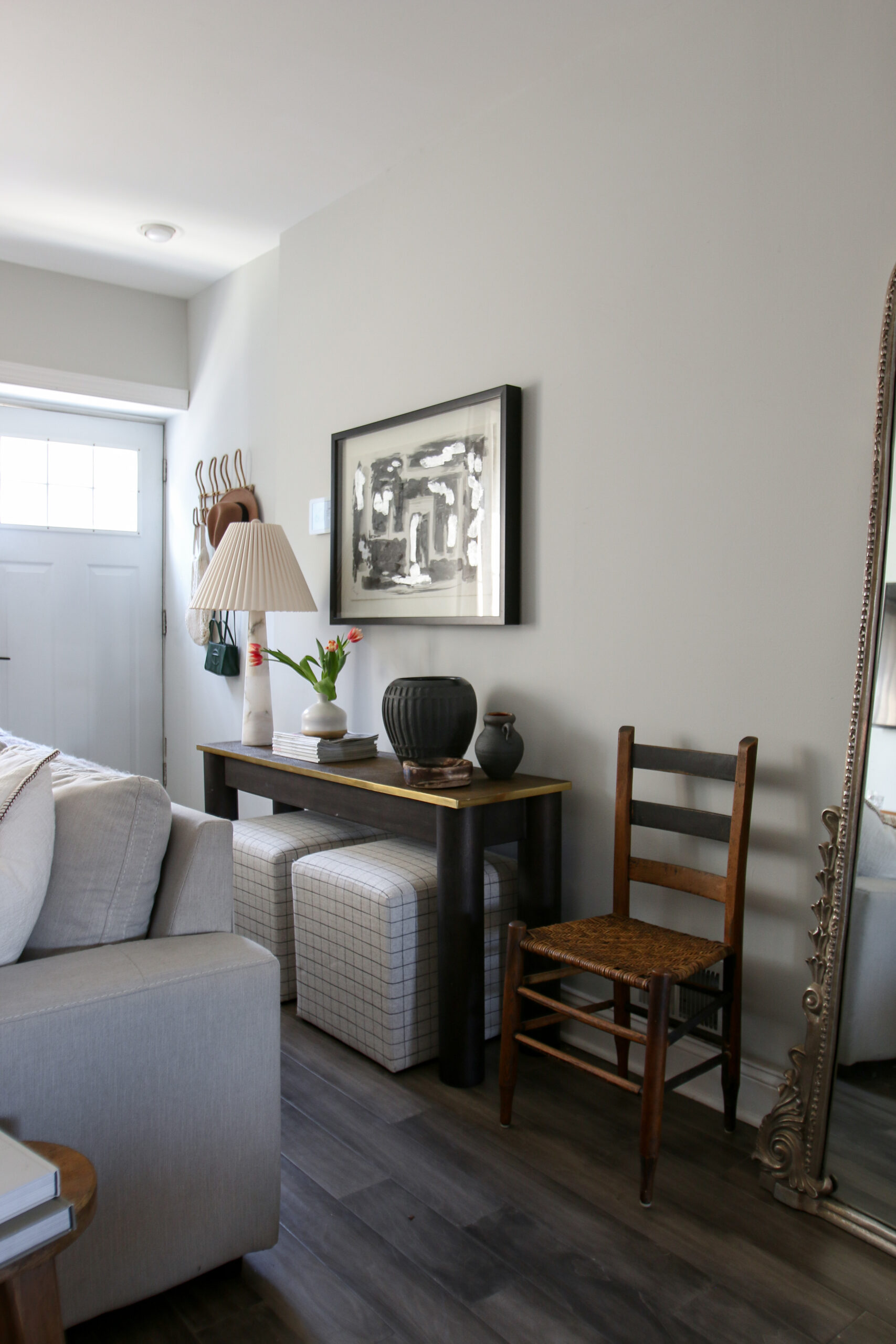
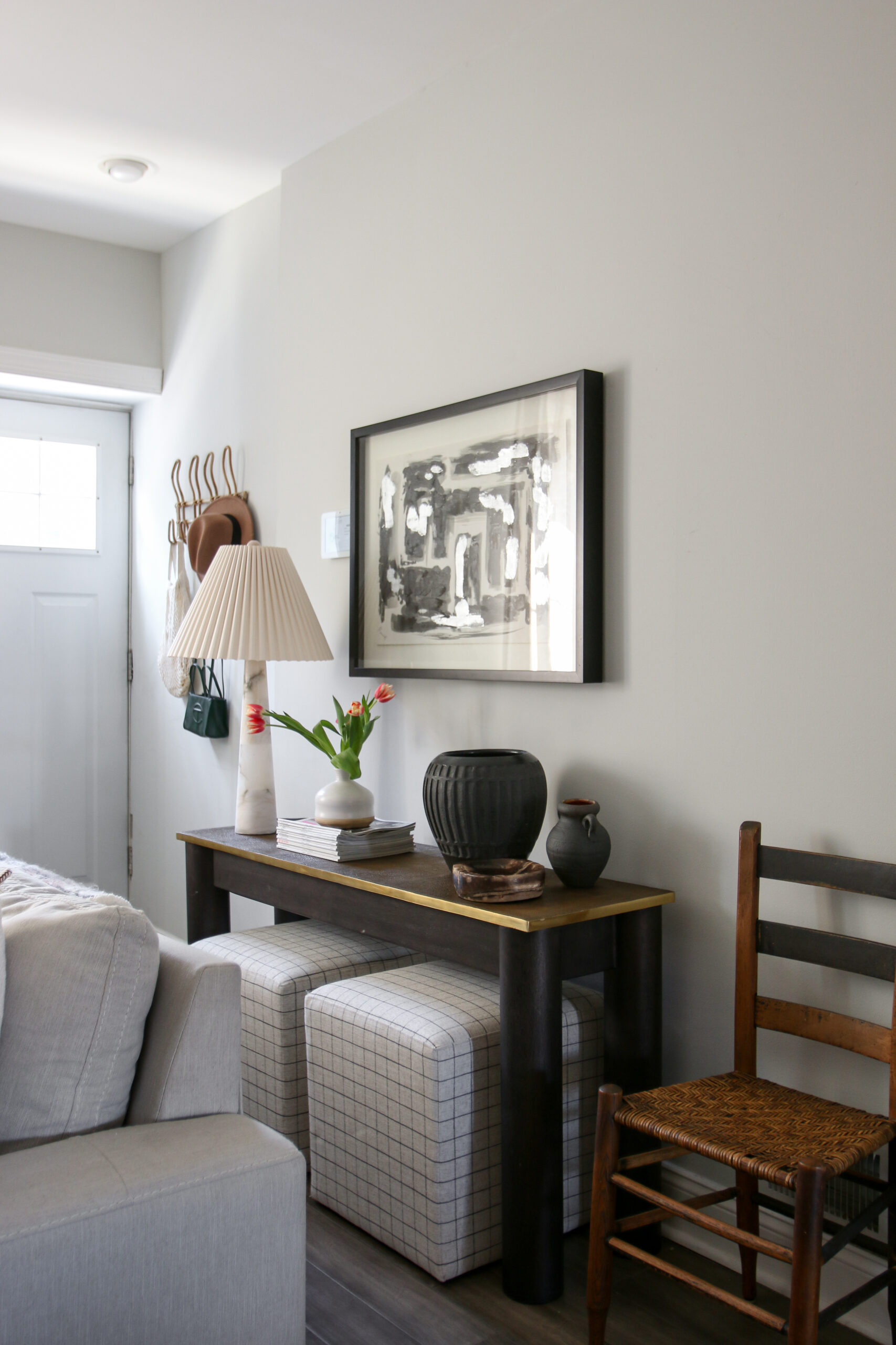
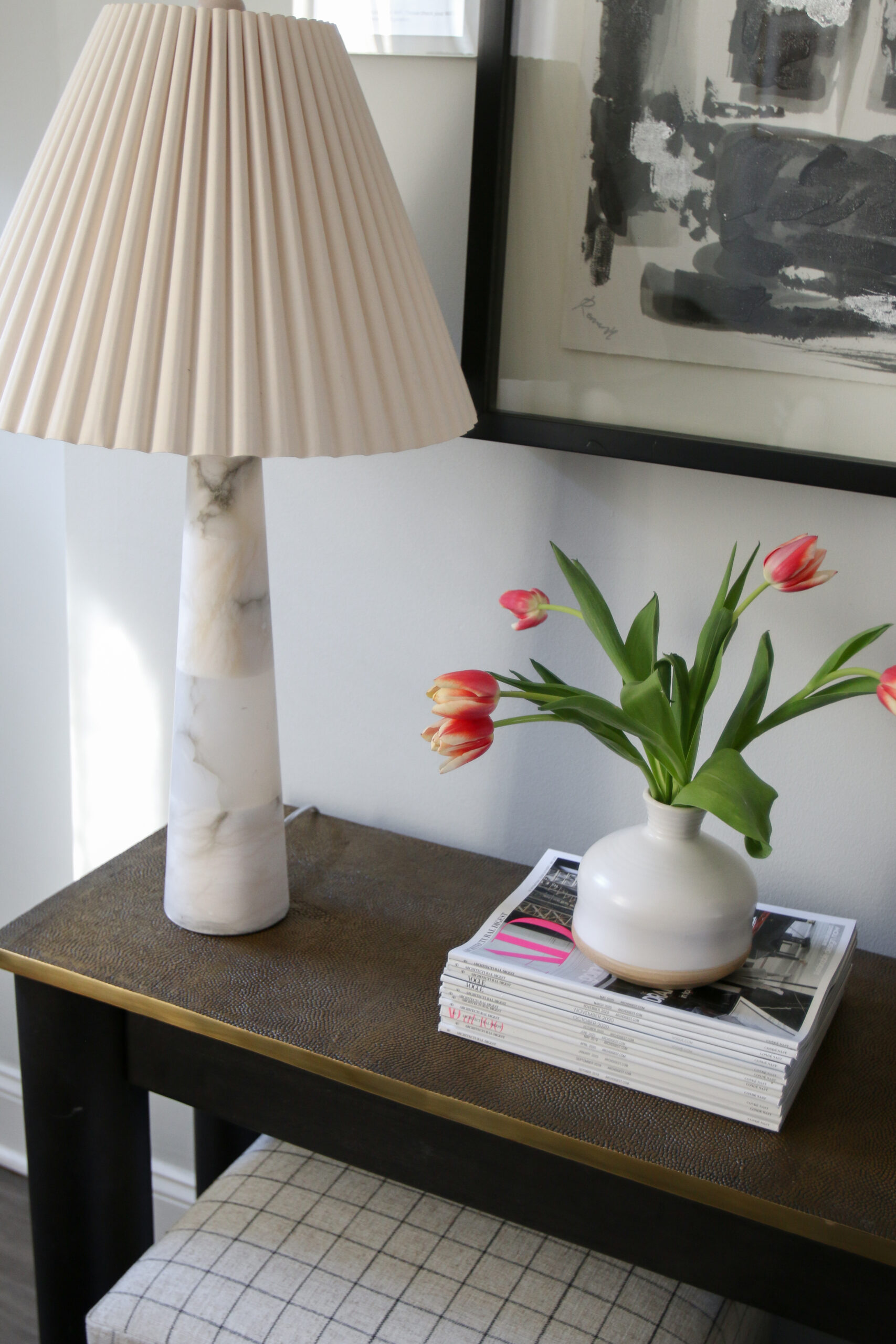
The main inspiration for this setup was the artwork. We actually had this piece lying around but never found a place for it. We love the dark design and the black frame. Simple and classic. Once we decided on the art, we wanted to bring in something softer. We added an alabaster lamp for a light source, Overall, we wanted this setup to be simple and clean. We added a few vessels, a stack of magazines, and fresh tulips.
Layer It Up
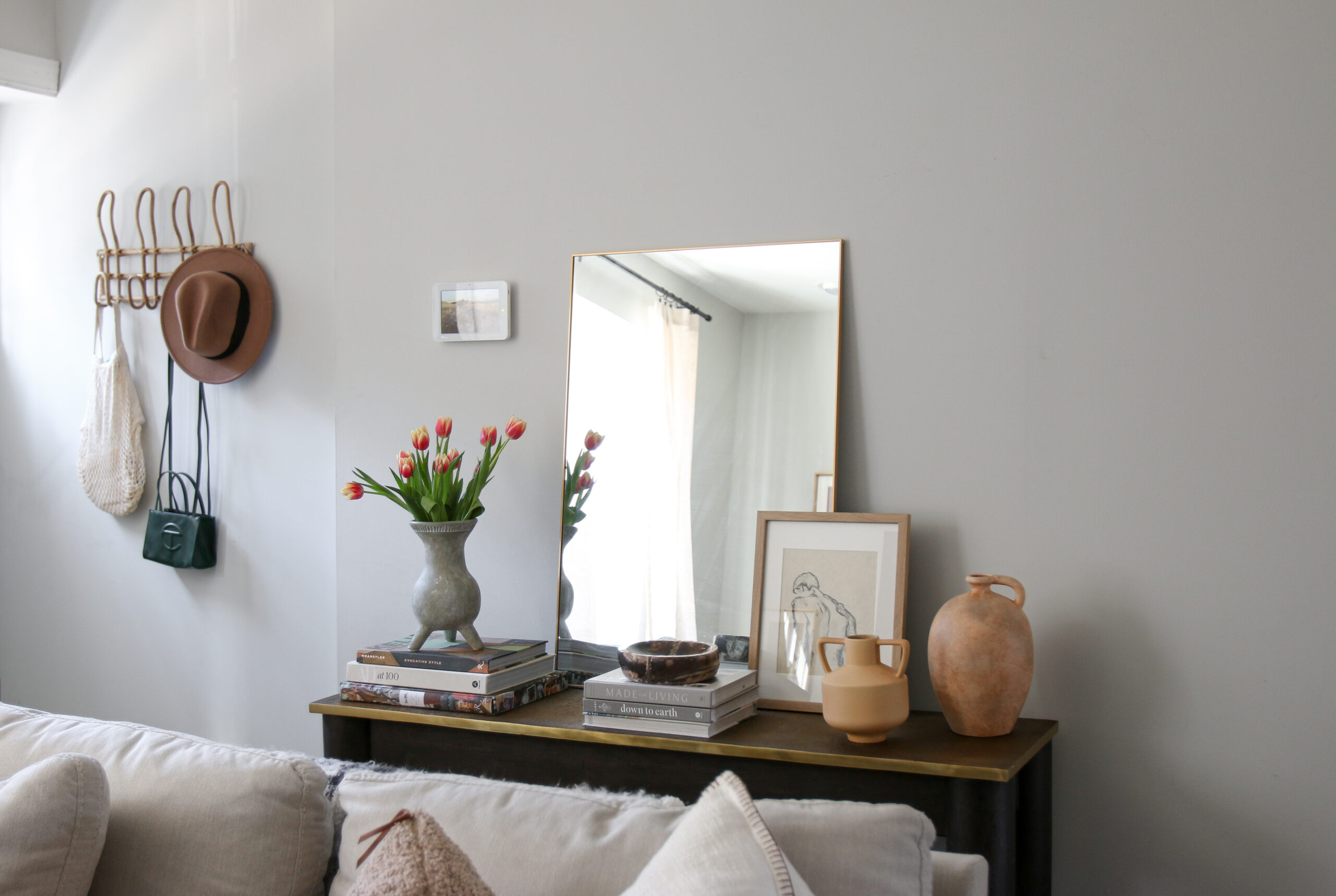
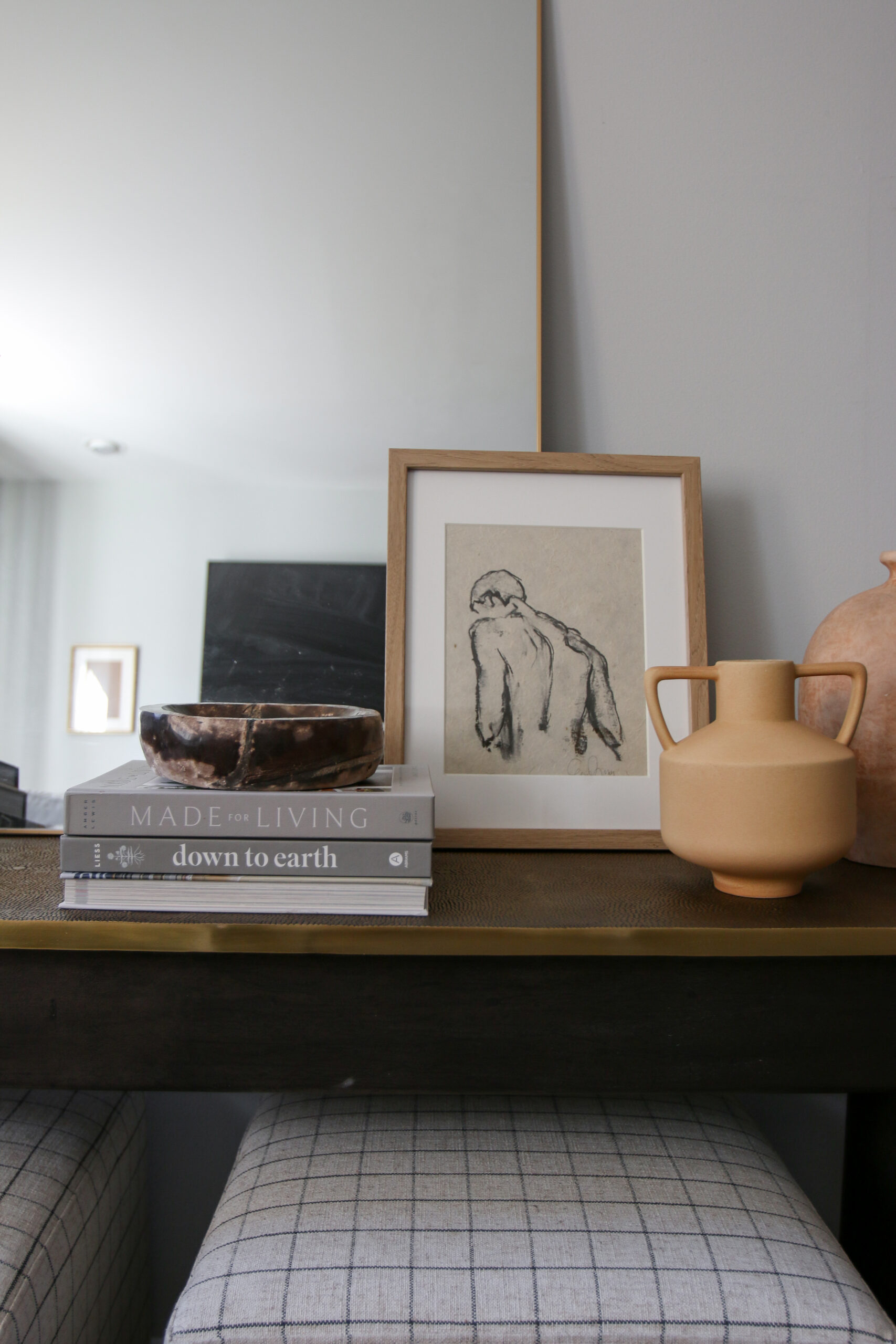
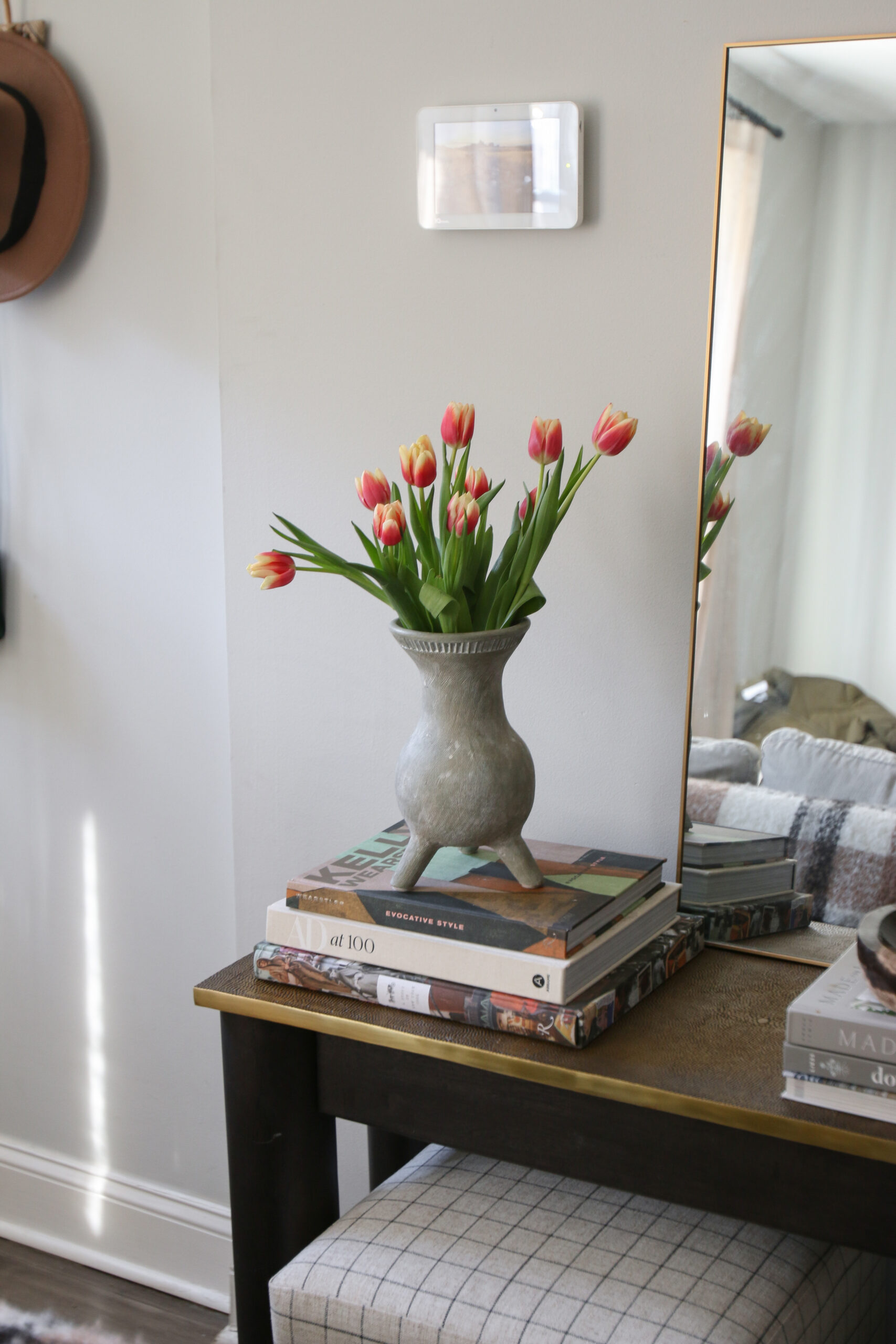
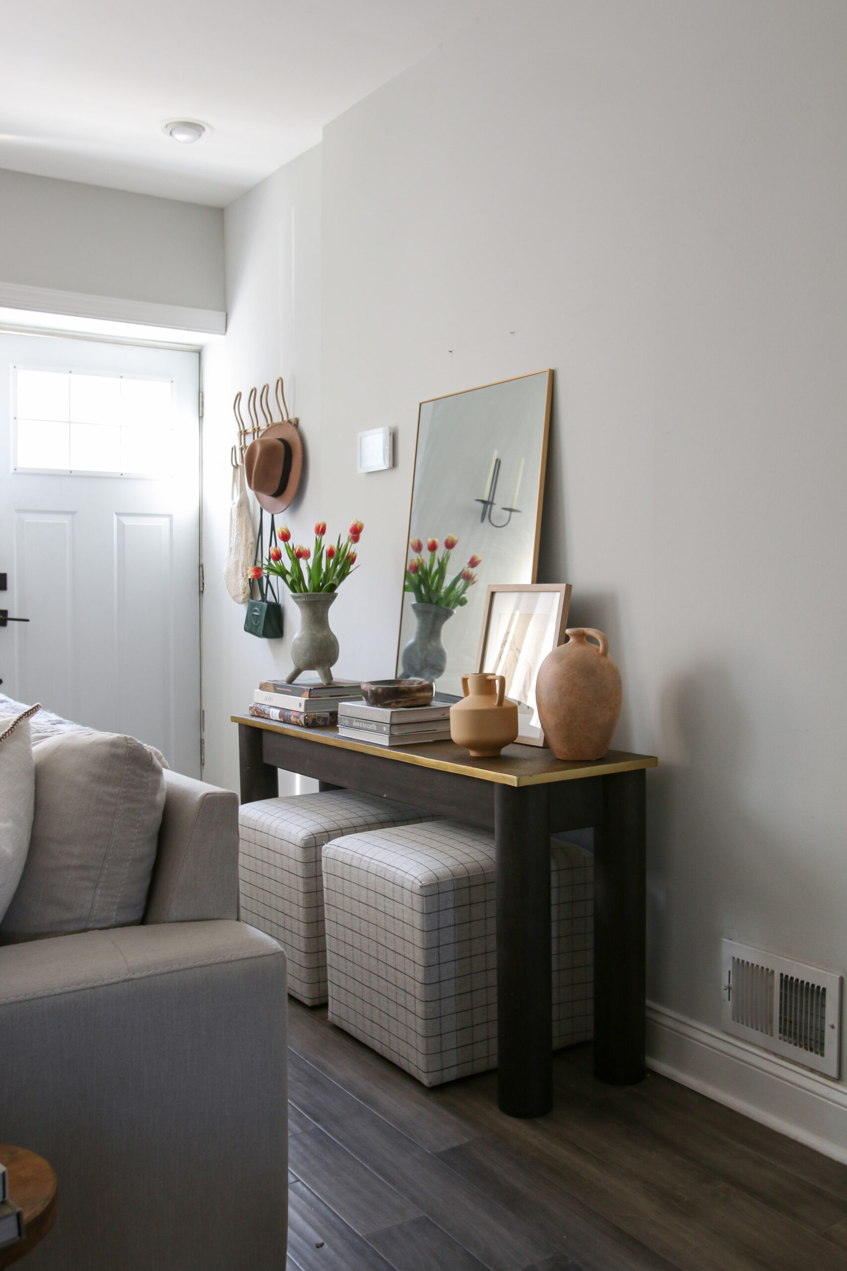
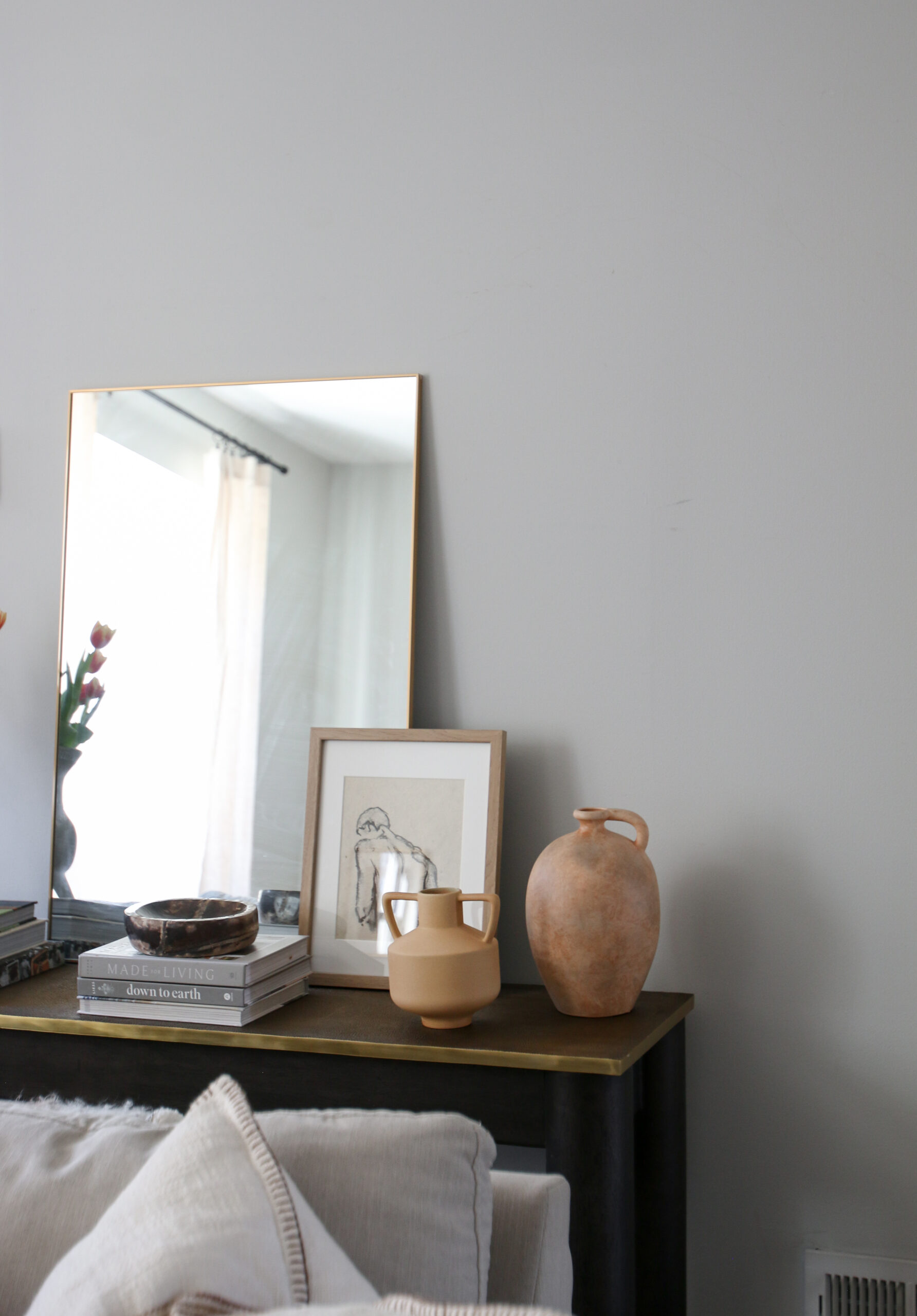
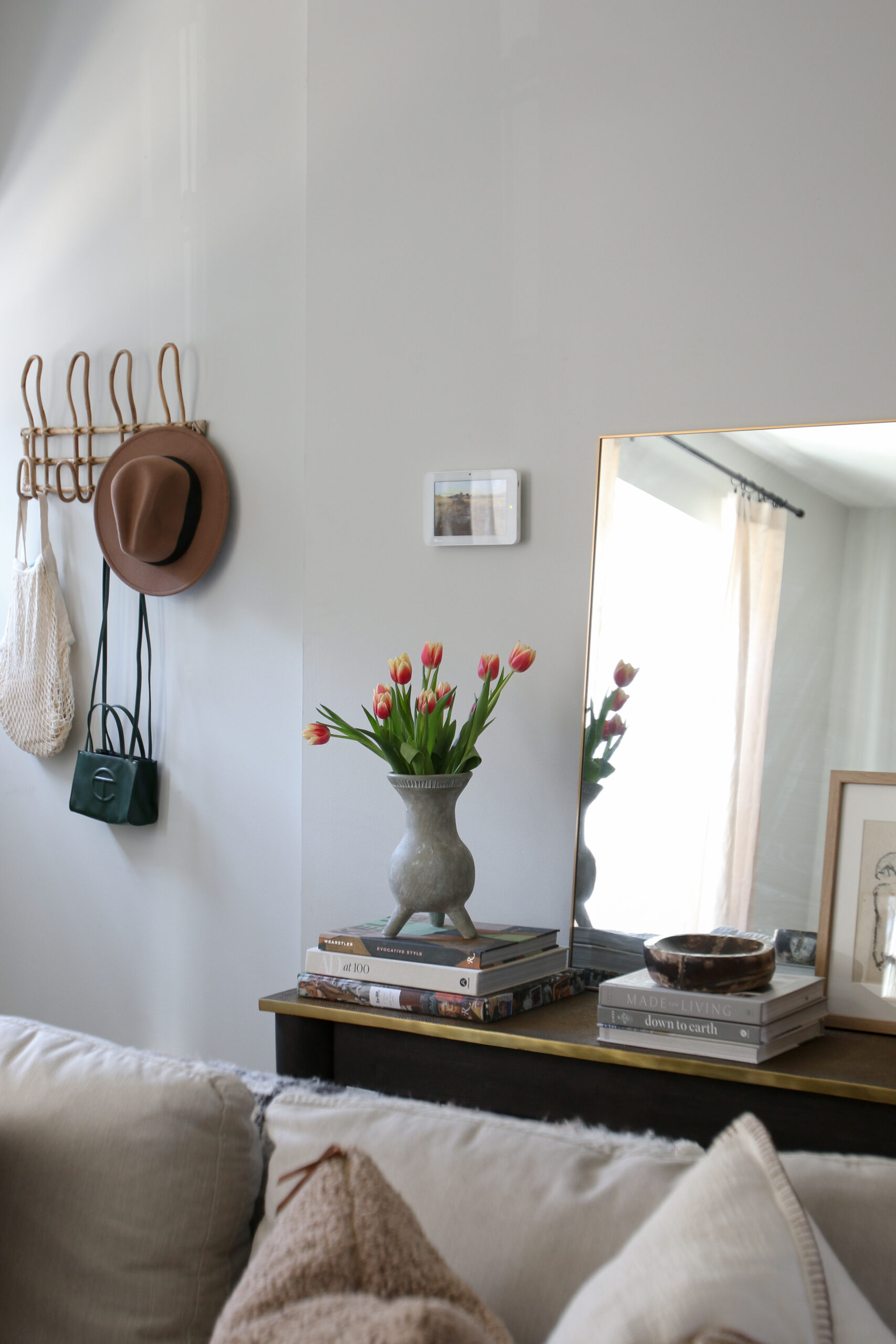
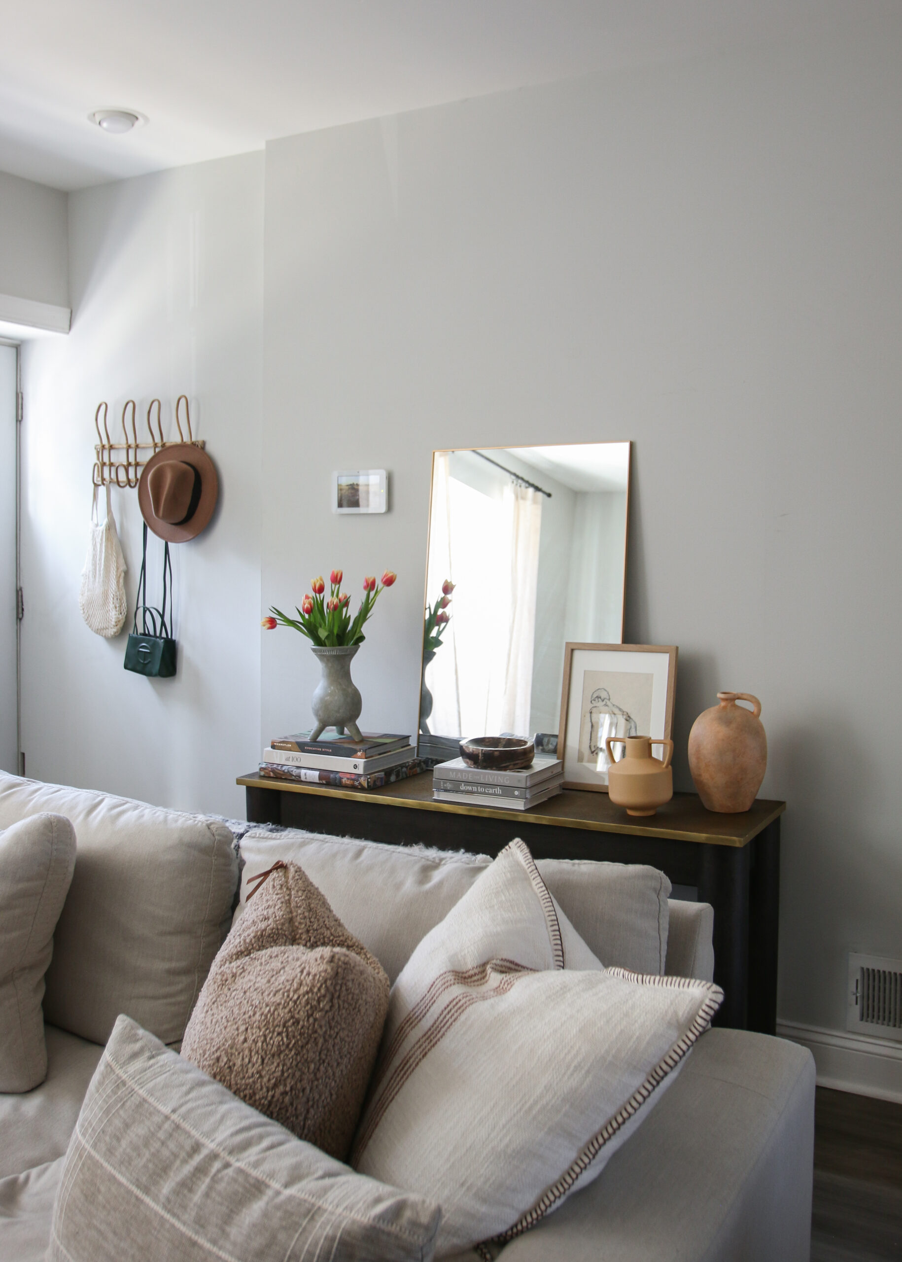
The star of this one is the mirror. We love using mirrors to create the illusion of a larger space. As you can see, we did not incorporate a table lamp which is totally okay! By adding a mirror, it helps reflect the light from the front window and gives you a place for the “last look” before you leave the house. We took this moment to layer a small piece of art in front. Remember that layering will add dimension and visual interest. As always, we take every opportunity to include fresh flowers everywhere. Tulips have been our favorite as of late. They are so beautiful and put us in a great mood! We finished it off with a few stacked books and two vessels that are total statement pieces.
Nature From Within
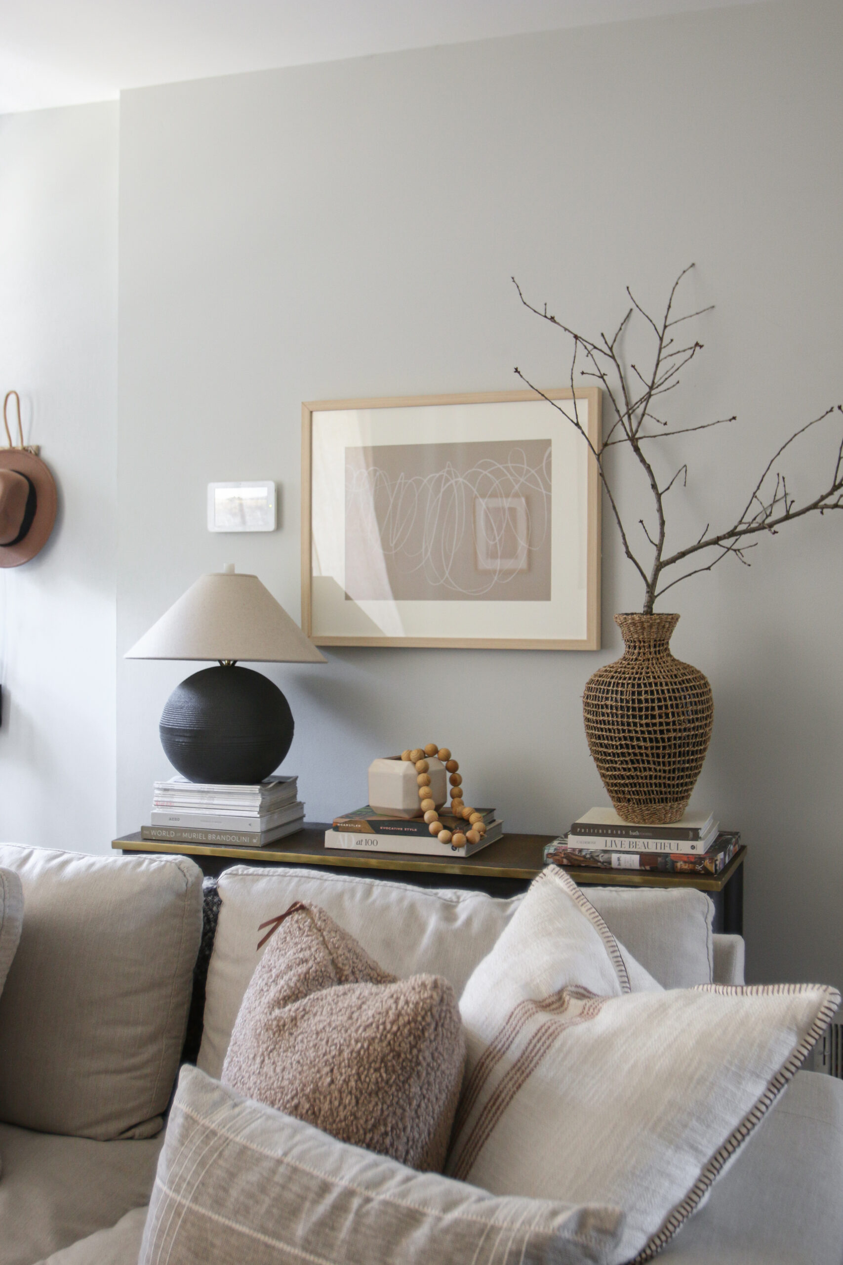
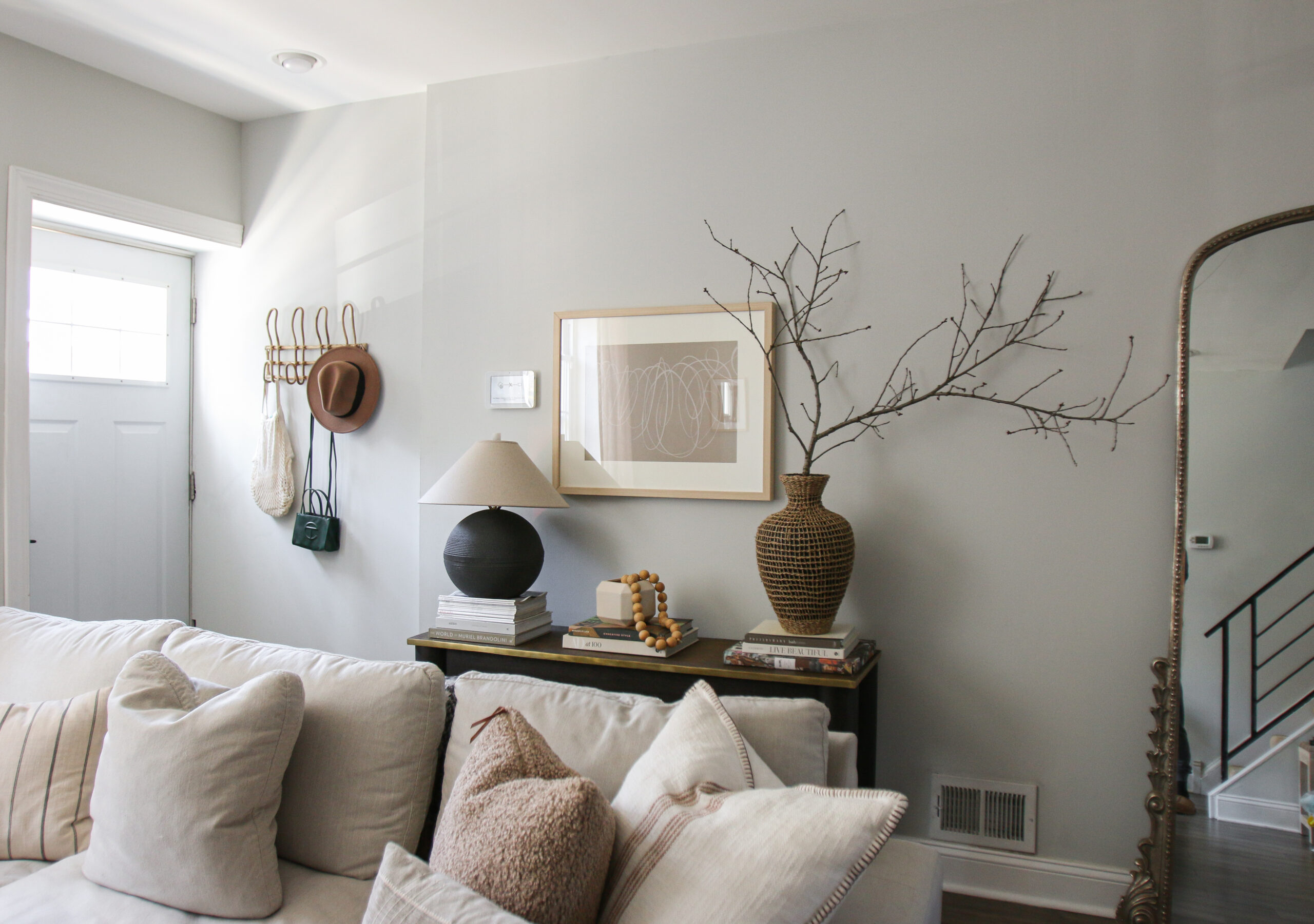
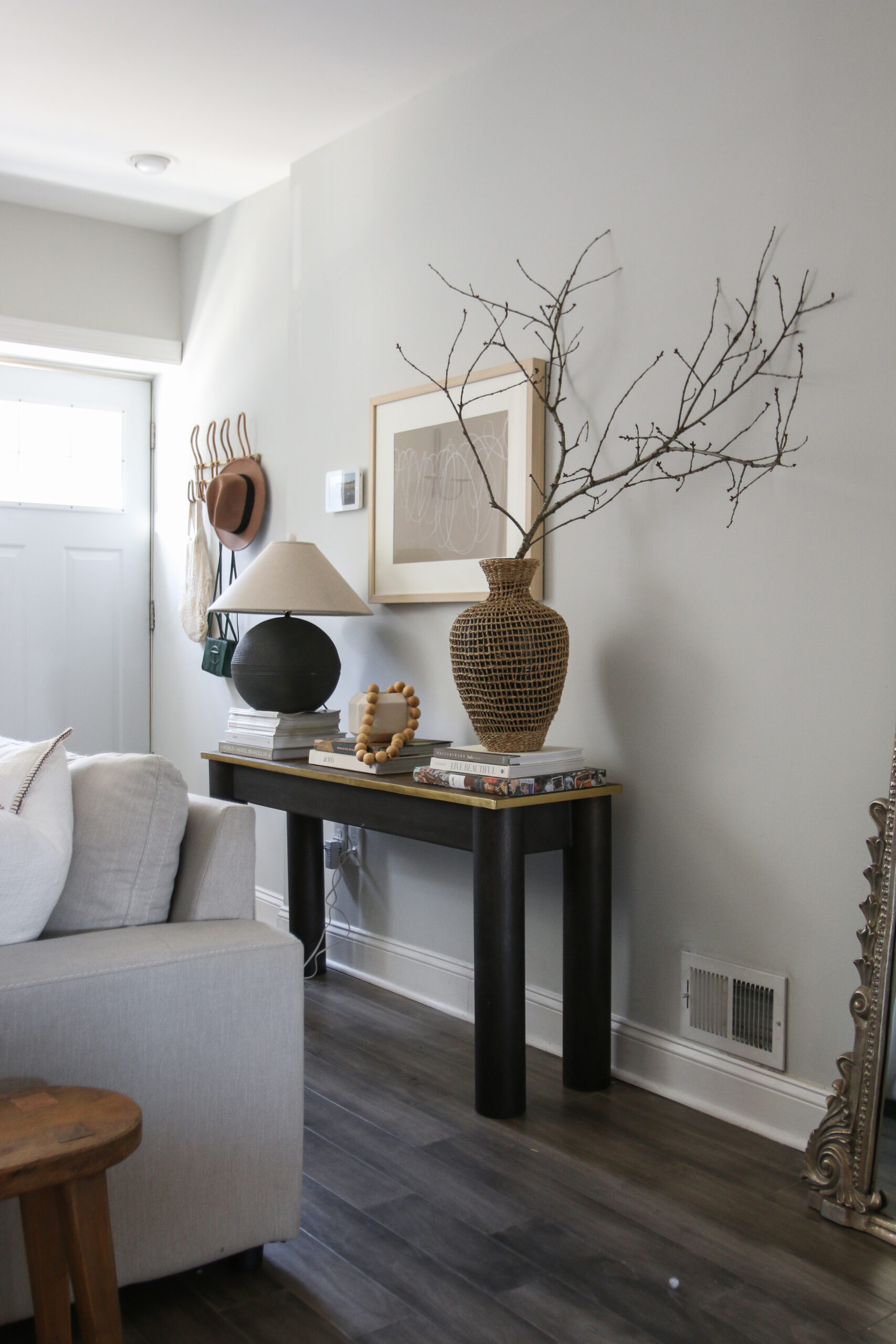
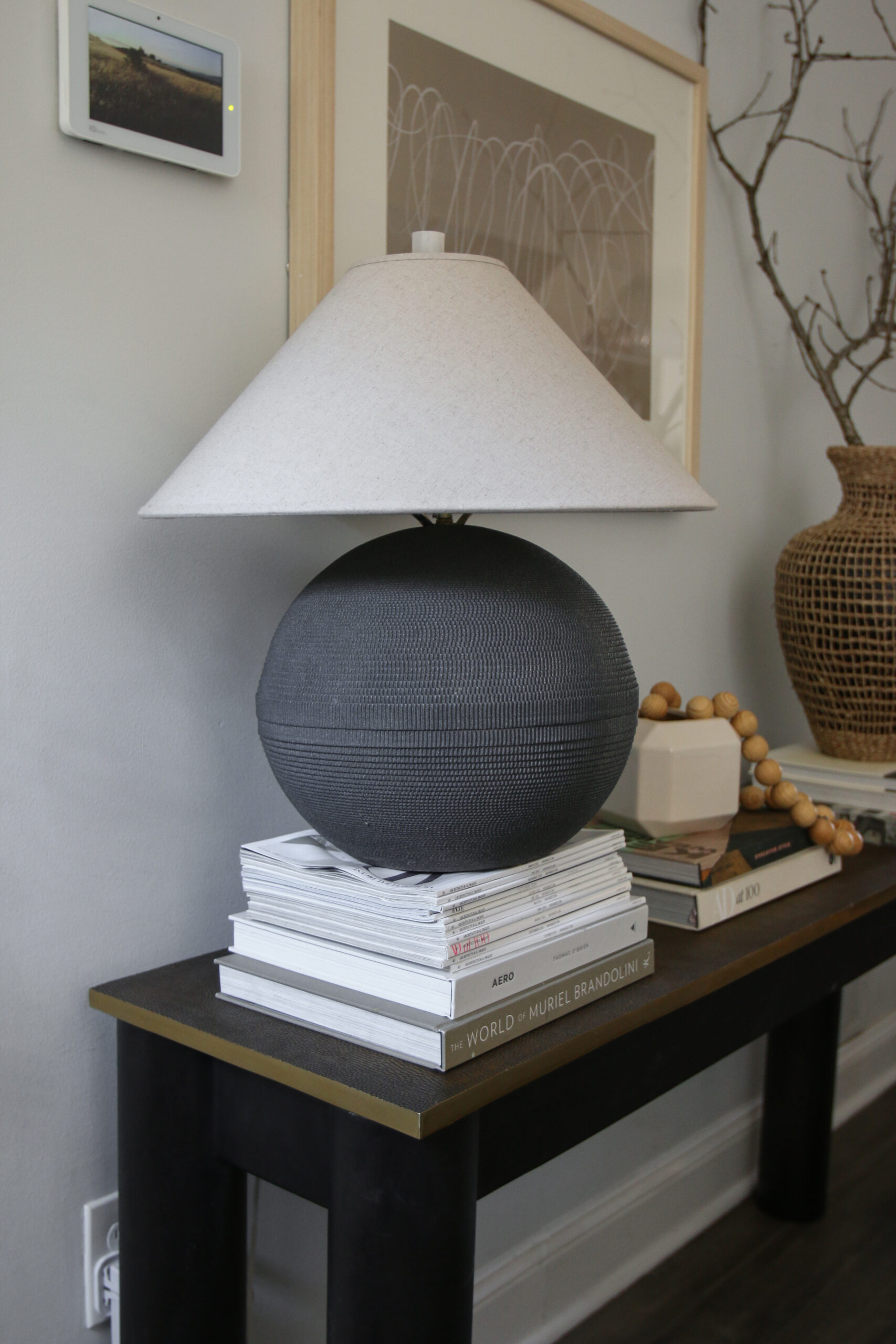
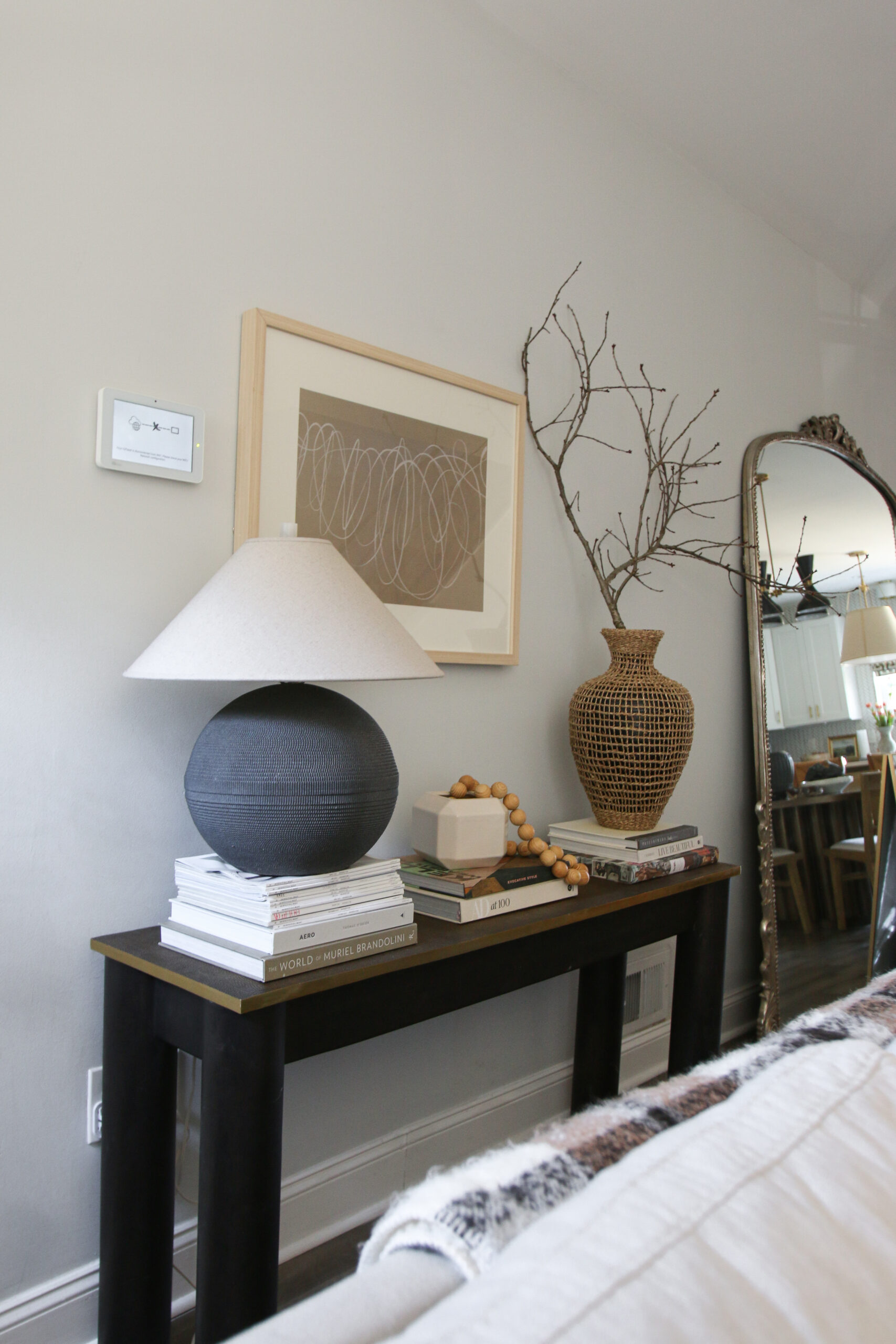
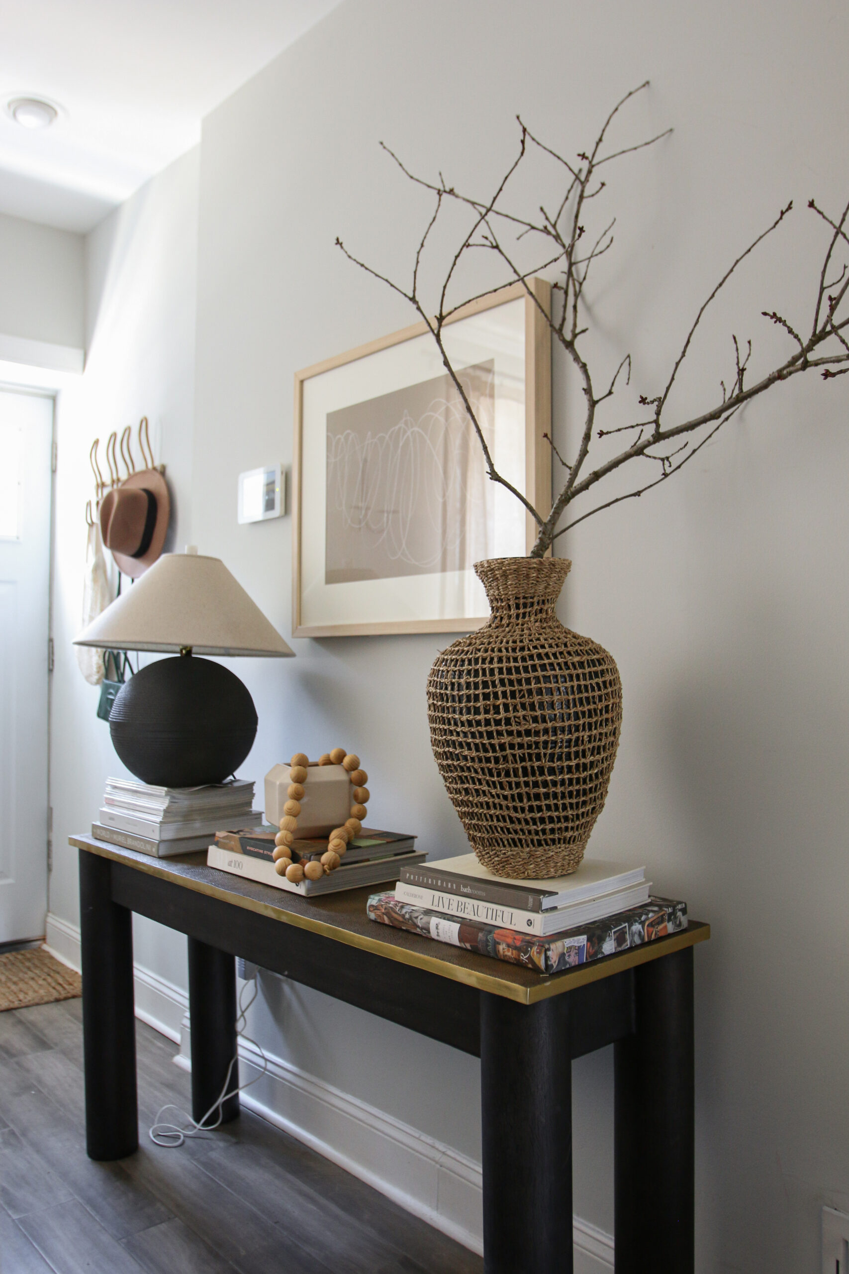
The last setup brings in one of our favorite design elements — nature. Inspired by Athena Calderone of Eye Swoon, we have found a love for foraging branches to use in our home.Usually the bigger the better. We love making a statement! Funny story with this one — we took it from Alex’s parents backyard. Yes, it made the 3.5 hour car ride home back to Philly. We placed the branch in a rattan vase on a stack of books. This added a bit more height while incorporating another texture. On the other end of the table, we brought in our DIY lamp that has a beautiful linen RH slope shade (more on Instagram). We finished off the console with some artwork on the wall and a small vessel with wooden beads. Don’t be scared to add pieces that are unfamiliar to you, that’s the exciting aspect of design – working with new materials/accents that will inspire you!
